


Lessons on Maintaining Brand Heritage
Thoughts on the Lyle's Golden Syrup redesign and a new classic from us


Hello,
This month we have new and exclusive work to share. I have not shared it on Instagram yet and I would love to know what you think. Alongside this, I couldn’t not share my thoughts on the truly controversial redesign of Lyle’s Golden Syrup, from which I think we can learn some lessons on how to successfully maintain a brand’s heritage over the years.
Brand Mentoring Service
I am excited to share with you a new service I will be offering from March. You will now be able to book in with me for 1:1 Brand Mentoring.
More details can be found in this post.
A much more affordable option, this will be ideal for anyone seeking support with redesigning their business, but who want to do the design work themselves. We will discuss the brand’s strategy and direction during a Zoom call. I will also be able to offer ongoing 1:1 support to enable you to tackle the rebrand yourself.
If the idea of designing it yourself is daunting, my Brand Creation Service could be just what you are after.
There are only 13 days left until I select the two winners of the rebrand competition.
If you haven’t already entered; all you have to do is subscribe to this newsletter (you can comment and share for more entries) - I will then pick two random entries out of a hat on the 15th March 2024 and the winners will be contacted soon after.
(If you are receiving this in your inbox you are already subscribed!)
See this post for more info.
*terms and conditions apply see this post for details

Lessons on Maintaining Brand Heritage with Lyle’s Golden Syrup
This section of the newsletter is where I share my opinion on either a redesign (that I have not done) or something that has happened in the brand design world. This month I couldn’t help but share my thoughts on the very controversial rebrand of Lyle’s Golden Syrup.
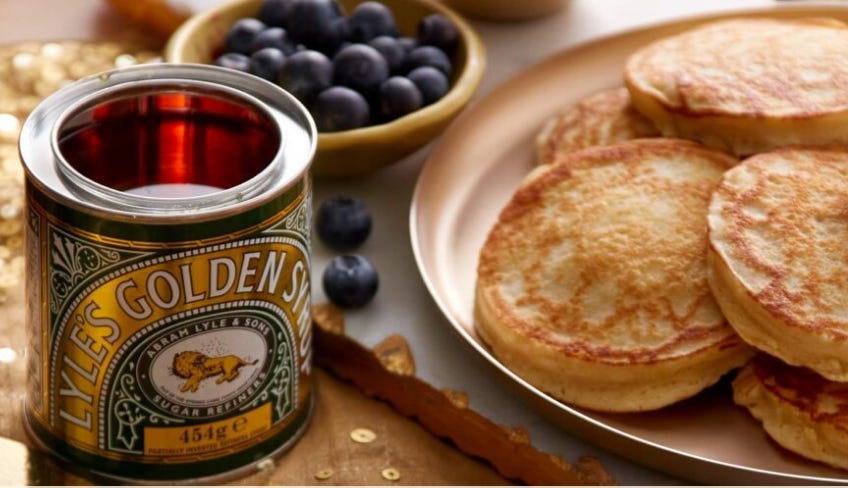
There is a lot of talk in the design community about the redesign of the much-loved syrup brand. It is iconic - one of those brands everyone has in their cupboards and that has had little redesign attempted on it. In fact so little that the design of the Victorian style tins haven’t changed since 1883 - a Guinness World Record1.
But in not changing their design much in the past, Lyle’s are now faced with an issue that only a significant redesign could solve – they need to appeal to younger consumers. Whatever they did was going to be wrong because people don’t like change.
So what lessons can we learn from the redesign of a brand with significant heritage?
The brand story is important
The original logo features a dead lion, surrounded by bees, who have made honey inside the lion’s carcass. It is based on the story of Samson from the Bible’s Old Testament and denoted by the quote “out of the strong, came forth sweetness.”
In redesigning a brand with this much history, it is important that we don’t lose sight of the brand story. In changing the styling of the lion within the logo, technically the story hasn’t changed. There is still a lion and there are bees. You could argue that it is much clearer now - the bees are more like bees rather than flies, flying around the lion. However, the lion’s status is much more ambiguous. The response from the Church seemed to suggest that the story was not being retold as well in the redesign. Sam Margrave, a member of the General Synod, the Church of England's legislative body, told the Telegraph: “There is nothing modern about ditching tradition or sidelining Christian messaging.”2 further suggesting that Lyle’s may “feel the need to eradicate their connection with their Christian founder’s iconic logo.”
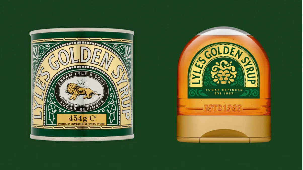
Heritage is in the detailing
Along with the strength of the brand story, I can’t help but feel that the heritage has also been lost. In the over-simplification of both the lion and the pack generally, most of the ornamentation has been removed. In taking away all the detailing on the squeezy bottles but keeping it on the tins, the two now feel very disjointed - one modern and one old, the newer of which loses the connection that it had to the past and the original feels stuffy and outdated.
The intention to appeal to younger consumers may well be correct, but in over-simplifying the brand assets, the brand is now more open to copy cats as brand equity has been lost. New assets that are more product-focused have been added with the inclusion of syrup droplets, which are then used off pack. In being product focused they are not ownable and can easily be copied.
Consistency is key
Any brand designer will tell you that consistency is key to creating and maintaining a strong brand. Lyle’s have benefitted from their consistency over the years - they haven’t changed their design for over 150 years! It seems now they intend to have two designs that will work alongside each other. One for the tin, and another for the squeezy bottles and the brand world. The inconsistency in the representation of the brand only serves to dilute its messaging and the communication of the brand values further.
Memory Structures shouldn’t be forgotten
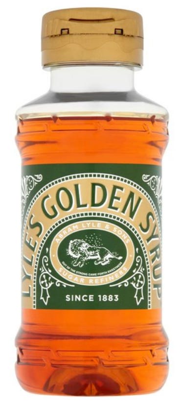
What has been maintained well in the redesign is the continuation of the arched type. This is something that is part of the iconic nature of the brand and key in consumers’ memories. In the simplification, though, we have lost the depth of including the white in the design and this gives it a different colour footprint in consumer’s memories. I wouldn’t be surprised if consumers now struggle to find it on shelf. Below you can see an incremental redesign of the squeezy bottles, which uses the existing logo - the elements of white and ornamentation are deemed important here and aid recognition of the brand.
Going Slow is Best
Controversy is often born from big and drastic changes, which in turn can sever the emotional connection consumers have with the brand and risk losing loyal consumers. What a brand can do to avoid this is make incremental changes over the years. This way we don’t have a Victorian brand lost in the 21st century with a need to appeal to younger consumers, who quite frankly are from a different planet than the very first customers the brand was designed for.
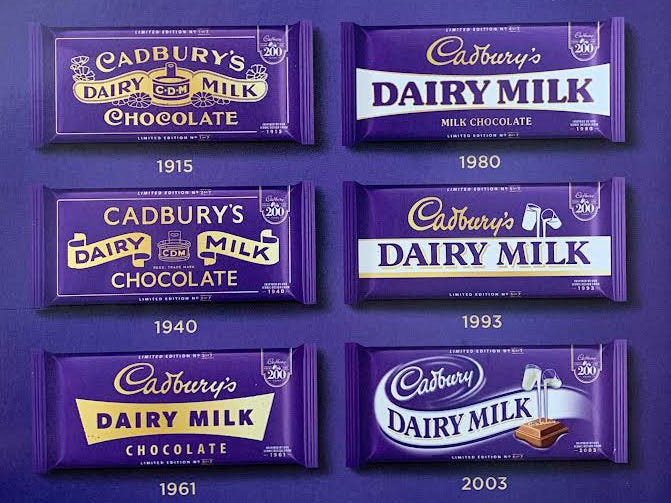
A brand such as Cadbury have done a good job of this as we have gradually been taken on the journey with design changes in small stages, allowing us to continue to have a deep emotional connection with the brand, despite it looking very different now than when it started. We still think of Cadbury as an old and iconic brand, and below you can see the changes are clear and celebrated. These packs from across the years are currently being sold in supermarkets in the UK, celebrating their 200th anniversary.

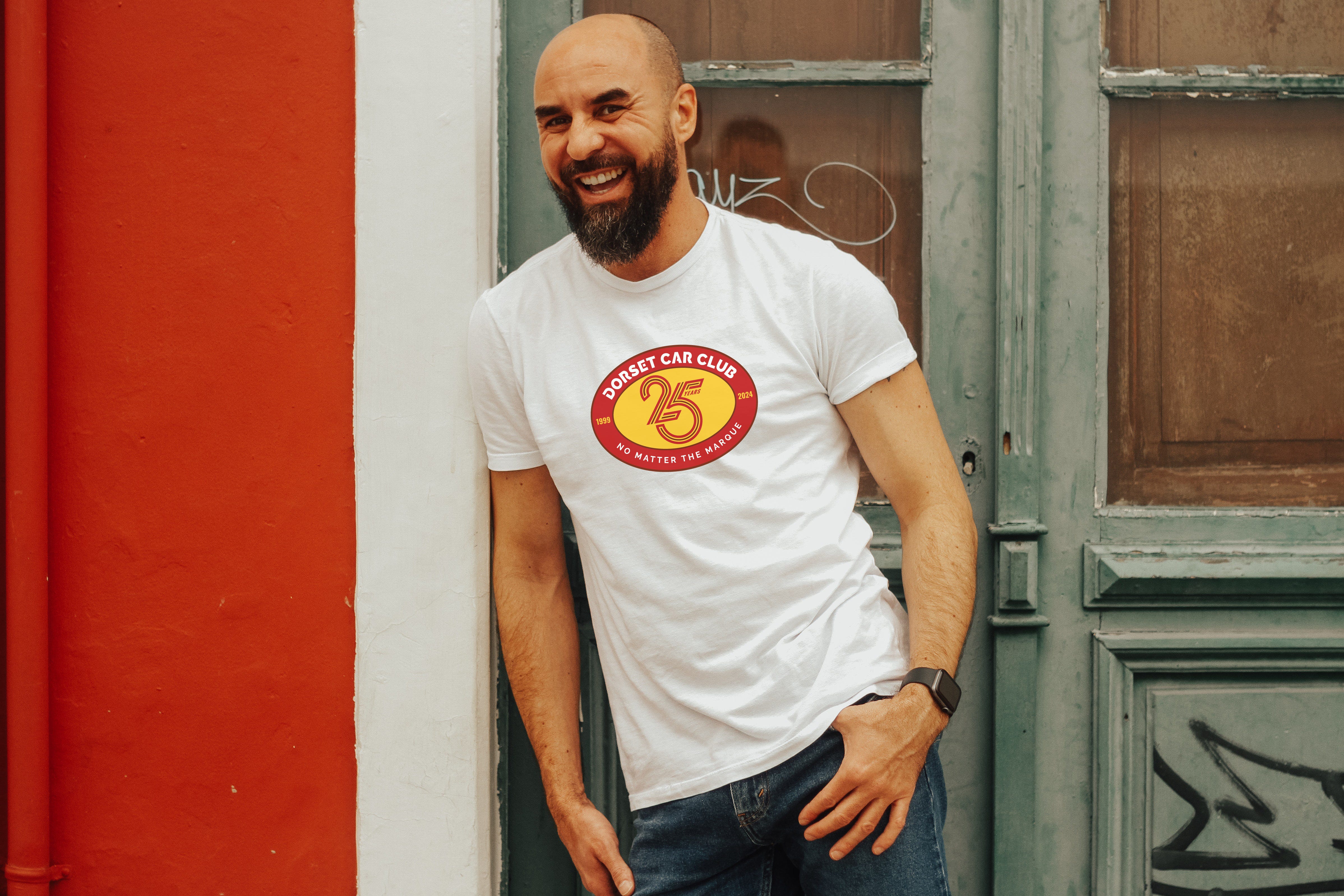
Dorset Car Club
I had a fabulous opportunity to design the 25th anniversary logo for Dorset Car Club, which I am excited to share with you.
Dorset Car Club is a classic car community based in the Dorset area. 2024 is its 25th anniversary and founder Chris was looking for a badge to celebrate this very special year. Inspired by the many pin badges and stickers collected by car enthusiasts, we landed on a distinctive roundel designed in the club’s colours, red, yellow and white, which are taken from the Dorset flag. The style of the number 25 is inspired by motion and tracks in motoring, which along the modern typeface, contrast with the more traditional oval roundel to bring together the old and the new. The badge has been designed in order to be used on printed and embroidered t-shirts, as well as stickers and social media.


K-A Creative aims to create memorable and meaningful brands for small businesses, to give them the tools to articulate their brand story and their brand values to their audience allowing them to thrive.
If you would like to work together, get in touch by replying to this newsletter or email: kylie.kacreative@gmail.com.
Thank you for reading,
from,
Guinness World Record: 2007 source: http://lylesgoldensyrup.com
Quoted from The Grocer “Lyle’s Golden Syrup Rebrand- justified or cultural vandalism?” Date: 23 Feb 2024.