


Breaking Category Norms with Francis Chappell & Sons
My opinion on a local rebrand and an update from the studio

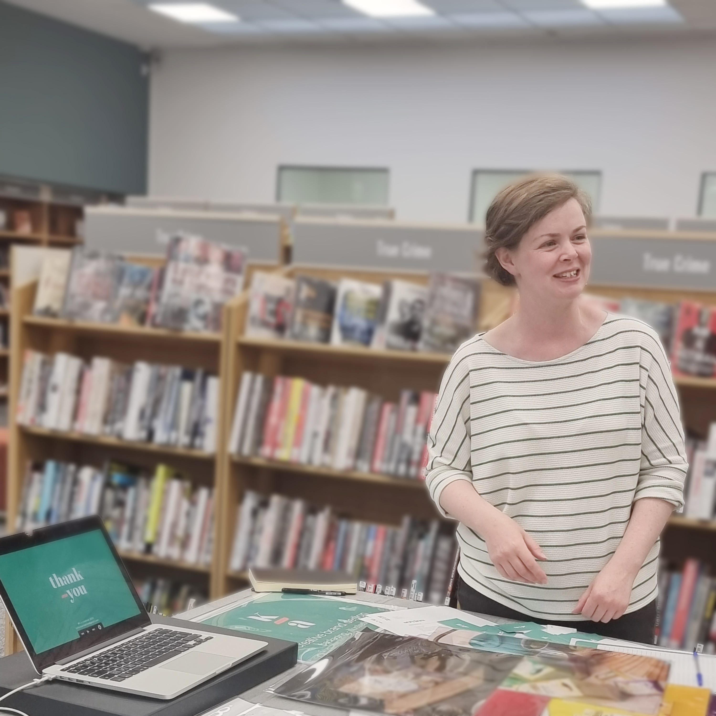
Hello,
This is the first edition of From K-A. Thank you for reading.

It was a while ago now but I really enjoyed meeting other small business owners at the Bromley Business Market in the Summer organised by Start Up Bromley. It was a real joy to chat through my work and what I do at K-A Creative.
If you were there that evening, thank you so much for coming and speaking with me.
I also recently attended a Start Up Bromley workshop hosted by Helen Manchip of The Social Surgery. It was really interesting getting to know aspects of Instagram and dare I say Tik Tok and how these could be beneficial to our small businesses.
Thank you to Helen and Chandra Sharma and the team at Start Up Bromley for organising.
In other news, this month I am launching the newsletter with a competition celebrating my first year of business. If you are interested in winning a free rebrand package* make sure you are subscribed to this newsletter to join in. (If you are receiving this in your inbox you are already subscribed!) See this post for more info.
*terms and conditions apply see this post for details

Breaking Category Norms with Francis Chappell & Sons
This section of the newsletter is where I share my opinion on either a redesign (that I have not done) or something that has happened in the brand design world. This month I am sharing my thoughts on the redesign of local funeral directors Francis Chappell & Sons.1
Funeral directors have long been associated with the colour black, so naturally when I walked past a local branch of Francis Chappell & Sons after their rebrand, it was the new brand colour that caught my eye.
Previously a deep maroon, the sign above the funeral directors’ is now a light teal. The rebrand has also included a crafted and considered typeface, integrating the C and the ampersand, tying together Francis and Sons. The handwritten slogan adds a soft, human touch.
The light colour, similar to the colour of the sky on a clear day, is distinctly the opposite of black. In choosing this colour they have done a few things for their brand, which I think we can learn from.

The colour helps to tell the story
The light teal is soft and delicate, adding to the caring connotations outlined in the slogan above the logo. It is a warmer shade of blue, to evoke the warmth of their care.
In addition the colour serves to support their brand positioning as a funeral directors who see funerals in a more positive light, bringing the brand colour away from the darkness of black that other funeral directors use does this.
The change in colour accompanies a rebrand where photography styling is more daylight-orientated. The relaxed, natural feeling imagery feels peaceful and content. The daylight is indicative of life, showing this funeral directors to be concerned with a celebration of life rather than a focus on loss.

It is unique
In bringing a light, airy and tranquil colour to this funeral directors, it stands out from its competitors. This consistent colour aids recognition and unites branches across London and the South.
It is unexpected
The colour change caught my eye and I am sure it caught many others. In changing their colour so dramatically, it has brought attention to their rebrand.
It breaks category norms
In branding, we aim to choose a colour that not only tells the story of the brand but one which will help the product and brand stand out from its competitors.
There is no point, for example, launching another purple chocolate brand. Not only may you have a law suit on your hands (as Cadbury has been in several legal battles over the colour purple, with Pantone 2685C being registered as a trademark as recently as 2022)2 but consumers could be confused having thought they bought something else or worse be unable to find your brand amongst the busy shelf. Not having an unique colour will mean consumers will be unable to recall your brand as it will be muddled in their memory with another.
Whilst the brand doesn’t need to sit on a shelf with other similar brands in the same way a pack would, the principle remains the same. With this distinct brand colour, there is no doubt that this funeral directors is different.

K-A Creative aims to to create memorable and meaningful brands for small businesses, to give them the tools to articulate their brand story and their brand values to their audience allowing them to thrive.
If you would like to work together, get in touch by replying to this newsletter or email: kylie.kacreative@gmail.com.
Thank you for reading,
from,
I couldn’t find who did design this, so if you know who, please let me know.
Source: City AM Cadbury’s allowed to register iconic purple colour trade mark in High Court ruling 07.07.2022