New Work: Pinnacle Pet UK
Happy pets are at the heart of this brand redesign for B2B pet insurance company Pinnacle Pet UK from K-A Creative
Hello! I am coming to you with exciting news of the rebrand I worked on earlier this year. It is frustrating working in design sometimes as we can’t celebrate our designs straight away and we have to hold on to a little secret for a while until everything is ready to launch - and as far as secrets go, this felt like a big one!
This was a brand creation project as it was a new branch of a larger company, Pinnacle Pet Group, which had no previous identity, so aside from the link to the parent company this was a blank canvas, which is both a wonderful opportunity and absolutely terrifying.
So come, let me introduce you to Pinnacle Pet UK.
Pinnacle Pet UK
Pinnacle Pet Group, one of Europe’s largest pet insurance and service organisations, came to me with the brief to create a distinctive visual brand for the UK branch of the business: Pinnacle Pet UK.
The UK branch is a business to business brand. The brief was to communicate values of trust and expertise and to explore varying degrees to which the new brand emulated the parent company.
Having explored a variety of options we landed on the option that was closest to the parent company Pinnacle Pet Group: the smile.
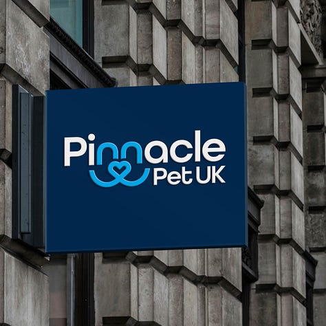
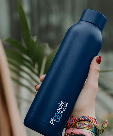
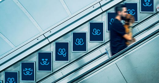
The smile device puts happy pets at the heart of the brand.
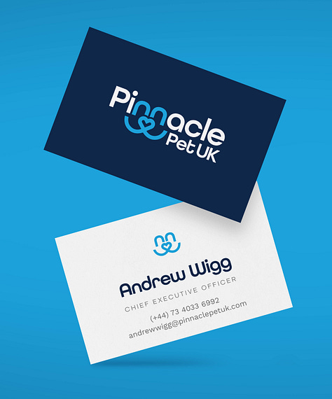
In utilising a similar device of the heart nose and smile that exists in the Pinnacle Pet Group brand and integrating it within the brand name, we can create a visual relationship to the parent company, whilst continuing to put happy pets at the heart of the brand.
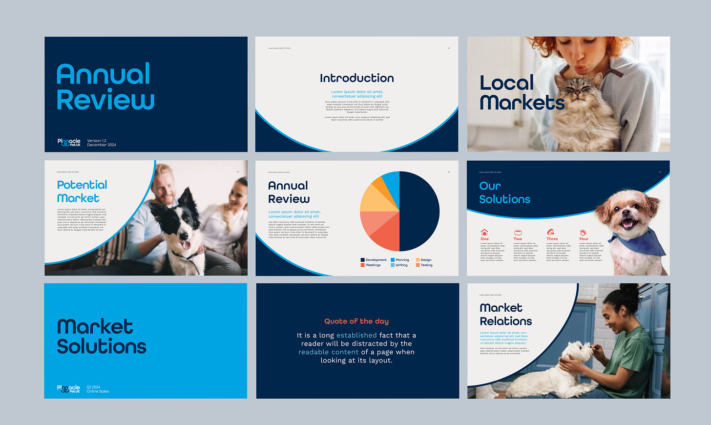
The simple sans serif typeface has rounded curves echoing the fluidity of the smile, contrasting with straight edges, ensuring a friendly, yet authoritative tone. The upward infliction of a smile is reflected in holding shapes on the website and in internal presentations.
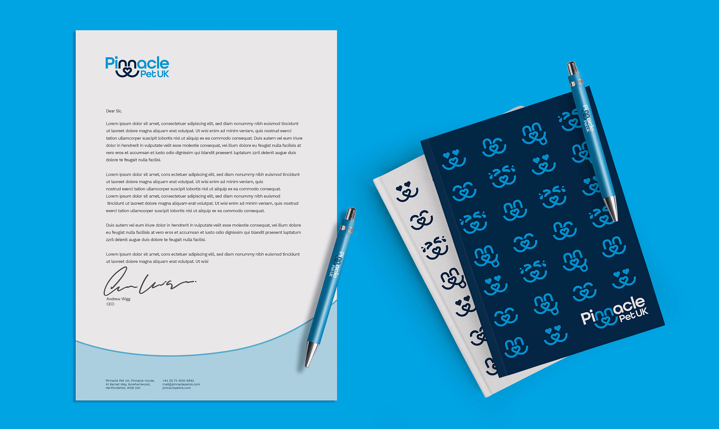
The colour palette of blues, white and an accent of red is evocative of the Union flag of the UK, differentiating it from the parent company whilst remaining trustworthy.
In isolating the smile and tweaking the expressions of the eyes, we are able to bring a more light-hearted side to the design, which can be used to show the brand’s joyful personality in internal stationery and signage.
The design has now been taken in house and will be implemented onto the website and internal communications using the Brand Style Guide document I have created, which will ensure brand consistency in its implementation.
Read more about this case study and more like this on my newly refreshed website
Thank you for reading,
from,
If you would like to chat about all things brand design in the Substack App, please do leave a comment and share your thoughts.
I am Kylie-Ann and this is K-A Creative.
I help businesses, big and small, thrive by ensuring that the brand identity works hard to establish an emotional connection with consumers.
I believe that meaningful brands are more memorable brands
If you would like to work together, get in touch by replying to this newsletter or email: kylie.kacreative@gmail.com


