How to Create a Brand Identity for your Substack
without necessarily hiring a designer
Creating a brand for your Substack is important for several reasons. As a writer, you will want your publication to stand out, you want to attract the right audience and you want it to be yours and yours alone.
But a brand isn’t just a logo, and not just any logo will do.
In carving out your own space for your writing the last thing you want is for all that hard work to have gone to waste with a brand that doesn’t do the publication justice; doesn’t stand out from the crowd, doesn’t attract the right audience and doesn’t communicate what the publication is all about.
And what if it all goes right?
If your publication soars on Substack and your writing career takes off, the brand you have created might need to translate on to more platforms - it might need to follow you onto the next Big Thing. If it is brand stemmed from truth and is unique, this will be easy to do, but if not the brand will have to be changed and with caution - so as not to lose any of your hard-earned audience.
It is important, therefore, that your brand works hard to not only reflect what the publication is about, but for it to have the flexibility to go the distance.
Of course, I know that not many of us sit in the place of being a brand identity designer and a writer, so I wanted to share with you some tips on how to ensure your Substack brand identity is the best it can be, however you create it.
Uniqueness is Key
First of all, it is important that a brand identity is unique. Creating logos with stock imagery and popular typefaces on Canva for example, can be problematic as this can create something similar to something created by someone else. Often it can be hard to differentiate between two similar publications on Substack, for this reason. On Substack this is particularly important when there is only a small logo on show; uniqueness is everything.
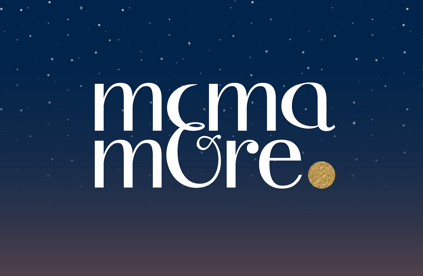
Customised typography can create a logo that no one else has. This can be done with a combination of typography and a symbol. For Mama & More, for example, we merged the & into the words Mama and More in a unique way, allowing for the symbol to create the missing letters and reveal the symbology of the moon within.
Create a brand from a truth
A unique brand story is an ideal beginning to any brand identity design. If the story is unique, so the mark will be. It also ensures with the effective communication of the story, that an emotional connection is forged, which in turn increases memorability and brand recall.
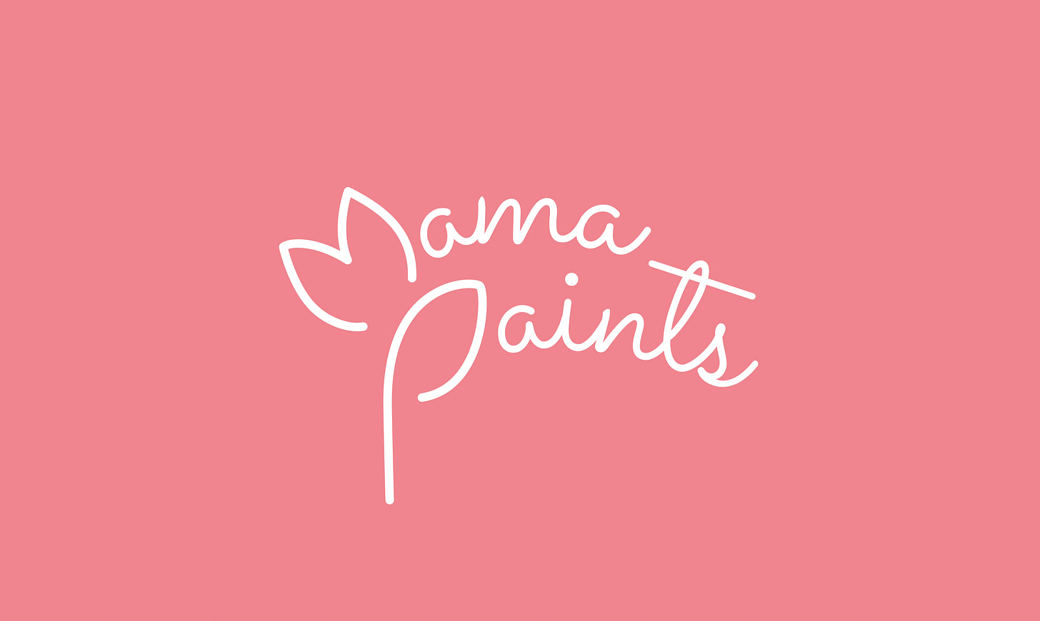
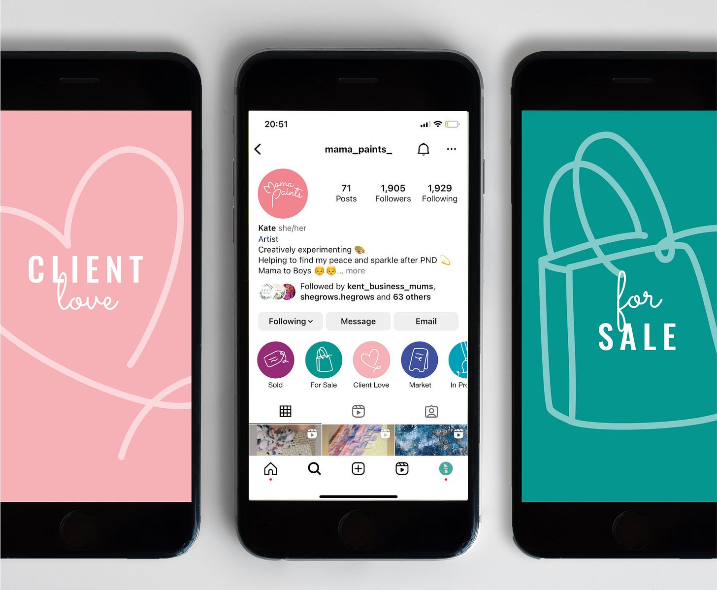
For Mama Paints, Kent-based painter, Kate, we created a unique mark telling the story her growth following the birth of her two sons and her experiences of postpartum depression, which led her to begin painting in the first place.
A distinctive colour palette
An easy way to create a memorable brand can be to use a distinctive colour palette. These colours should stem from the brand story and communicate the values of the brand, along with the brand mark. It is in the combination and the unique shades that we can create distinction. If we think of famous brands, their colour combinations have been integral to their memorability, for example, IKEA and their blue and yellow, stemming from their Swedish roots, or McDonald’s and their classic combination of red and yellow. For Salvia Glass, we celebrated the link to the Salvia plant and its lavender coloured flowers in combination with a deep emerald green representing its foliage.


Stand out from the crowd
To ensure your brand stands out from the crowd, it is essential to establish what the crowd looks like. In any category that we design in, we conduct an audit of potential competitors to help define the design. It is important not only that we create something new and different but that it stands out to the consumer. Both meaningful symbology and unique colour combination and imagery can be a great start in achieving this.
Ensure the proposition is communicated
It is essential in the brand identity design that the feeling of the newsletter is communicated. This can be crucial to not only help find the right audience, but for that audience to feel satisfied. It is important that their expectation formed through the visual identity and the unique brand assets is in line with the content that is published.

The little touches
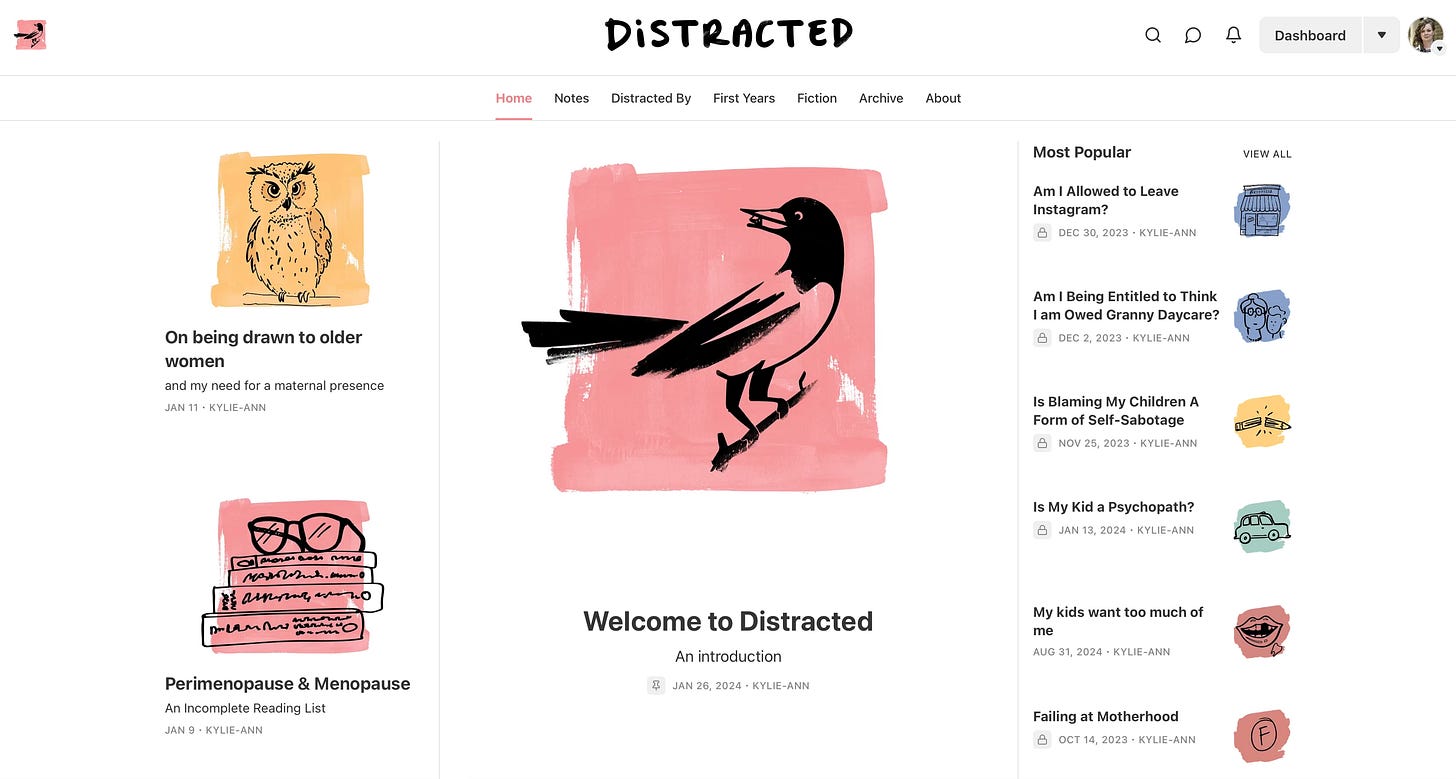
The brand is also in the details. On Substack there are opportunities to extend the feeling of the brand onto illustration and photography styles. If this is done consistently it can come to represent the publication and hold it all together. This is something that we have done for Distracted, a publication celebrating life through the lens of honest motherhood. It was important for this publication that the illustration style both represented the chaos of motherhood, but was also able to be maintained despite it - and it’s still going 2.5 years later.
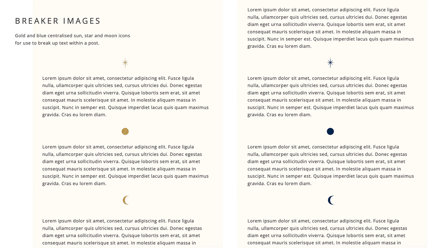
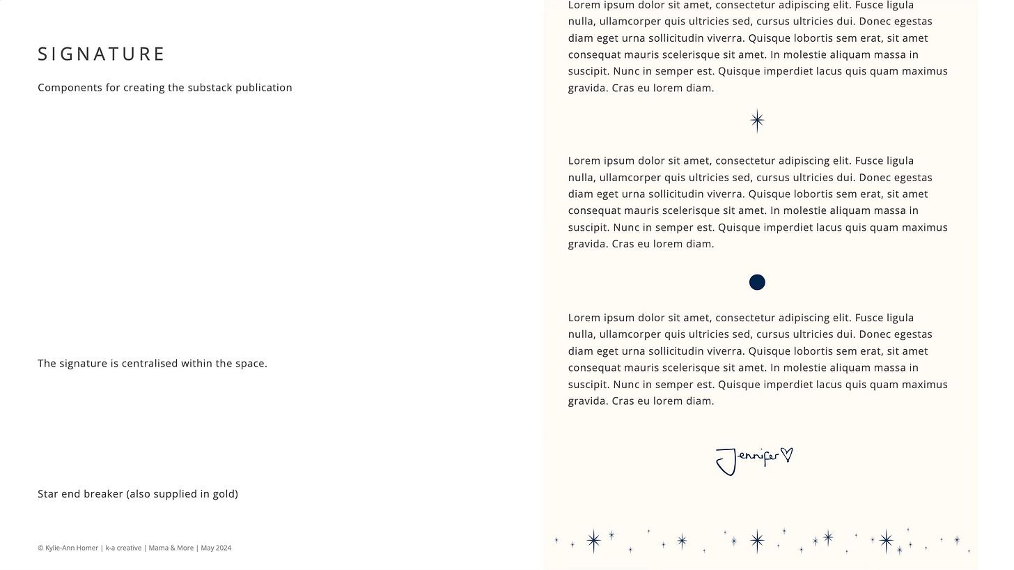
There is also an opportunity to tell the brand story within the post itself. For Mama & More, for example, we created iconography to be used as breaker images within the text, and developed a unique signature for Jennifer to use.
So whilst not all writers are designers, it is possible to take some lessons from the world of brand identity design and use them to create knock-out Substack brand identities for your publications that could not only aid growth but become a brand you use beyond Substack for years to come.
See Mama & More on Substack
Read more about Mama & More, Salvia Glass and Mama Paints on my website.
Thank you for reading,
from,
If you would like to chat about all things brand design in the Substack App, please do leave a comment and share your thoughts.
I am Kylie-Ann and this is K-A Creative.
We help businesses, big and small, thrive by ensuring that the brand identity works hard to establish an emotional connection with consumers.
We believe that meaningful brands are more memorable brands
If you would like to work together, get in touch by replying to this newsletter or email: kylie.kacreative@gmail.com


