


Blast from the Past
Blast from the Past
Is looking into your brand’s history for your next redesign the lazy option, or a stroke of genius?


Hello,
I am a little late with the newsletter this month because it has been suitably busy, which is fantastic. I am very lucky to be working on a new branding project, which I will of course share when the time is right.
I have begun the month by offering two lucky winners a brand refresh from the competition that came to a close last month. I hope to share with you the results of working on these two very exciting projects when they are ready. It really is a great opportunity for me as well as the winners, as I get to stretch my creative muscles and work alongside new people, which is always very exciting. Apologies if you were not a winner this time, but if you are keen to work together, my inbox is always open.
Brand Mentoring Service
You can now book in with me for 1:1 Brand Mentoring.
More details can be found in this post.
A much more affordable option, this will be ideal for anyone seeking support with redesigning their business, but who wants to do the design work themselves. We will discuss the brand’s strategy and direction during a Zoom call. I will also be able to offer ongoing 1:1 support to enable you to tackle the rebrand yourself.
If the idea of designing it yourself is daunting, my Brand Creation Service could be just what you are after.

A Blast From the Past
Pepsi’s redesign has appeared in shops in the last month, with a modern, clean pack design complimenting their 90s inspired logo, which was announced this time last year.
Following a trend of other brands pulling logos from the brand archives, I wanted to ask the question is looking into your brand’s history for your next redesign the lazy option, or a stroke of genius?

Pepsi is the classic example of a brand that has historically lost their way. Often compared to the legendary Coca-Cola, their to-ing and fro-ing with their logo feels inconsistent and confusing in relation to Coca-Cola’s iconic and mostly unchanged logo. Comparatively, the brand feels like it is lacking in heritage, when this is undeserved.
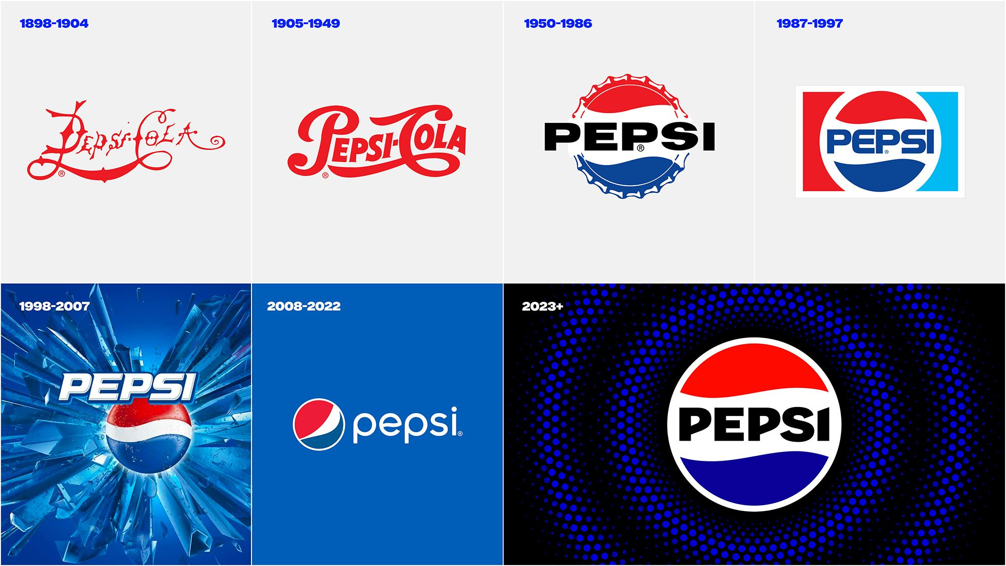
So, perhaps, it is no surprise that their latest rebrand, announced last year has been heavily inspired by the Pepsi Logo from the 90s, giving consumers a pleasant hit of nostalgia along with some bold and contemporary new pack designs, but they are not the only brand who has looked into their past for their redesign.
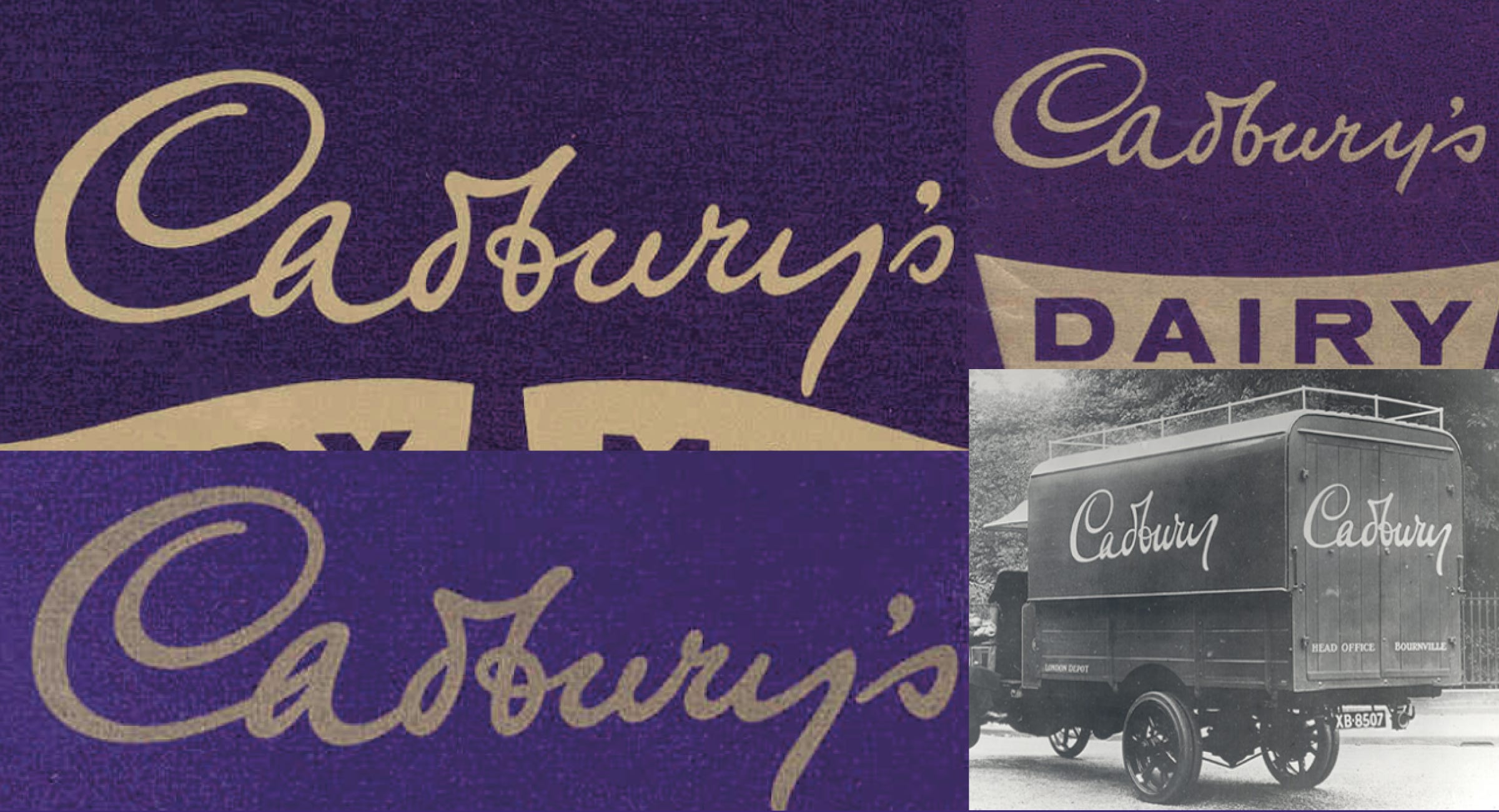
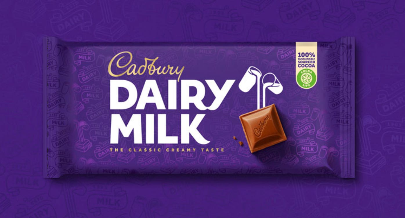
In 2020, Cadbury rebranded with a new and more modern pack design, which on first impression is too slick and bold to be anything but contemporary, however, if you look closely at the signature, this will feel familiar. You may say the improved signature is not worlds away from that which came before it but, in fact, it has been redrawn and crafted to be more reminiscent of the original signature logo, featured below on 1920s packs and trucks, which was inspired by the signature of the founder’s grandson.

As well as the logo being inspired by the brand’s rich history, the pattern in the background is inspired by the first-ever pack of Cadbury Dairy Milk bar from 1905 bringing that sense of heritage and ownership to the purple whilst adding a delightful element of discovery.
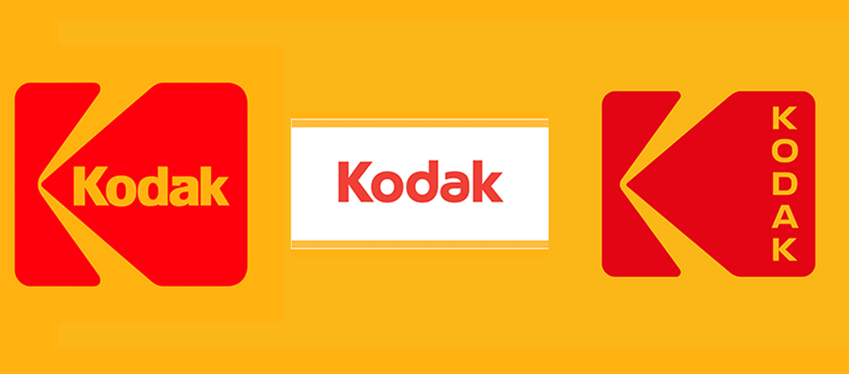
This trend of retro-branding is not new. Kodak rebranded in 2016 with their logo inspired by the 1971 design, which aimed to celebrate their long-standing history with photography bringing back the icon of the roll of film itself . In modernising the typography on the right hand side of the film strip icon, and stacking it they have given further context and purpose to the original design, whilst also communicating the brand’s legacy. With such a product offering that isn’t future-proofed, it makes sense that Kodak would lean in to its retro revival.
Of course, bringing a design from the past into the present is a risk and can be perceived as lazy if it is not backed up with purpose and developments which help the brand to connect with modern consumers.
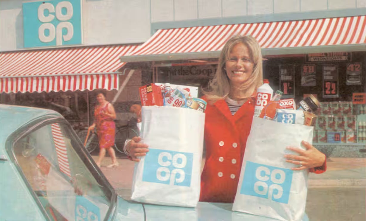
The Co-Op redesign in 2016 resurrected the simple clover leaf logo from 1968 with barely any changes. This is apparently because the original already felt simplistic, but does the brand do enough to connect with today’s consumers?
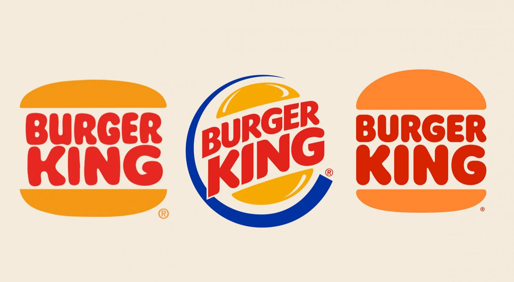
Similarly, Burger King’s retro burger redesign is very close in resemblance to the brand of the 1970s-1990s. The retro re-design was spurred on by the brand being regularly referenced in pop culture from Back to the Future to more recently Stranger Things, but does it continue to appeal to consumers who may not know or care to know a brand from yesteryear?
What we can learn
From what we can see from these numerous examples of retro re-branding, and there are many more, is that it is definitely a trend. Fashions come and go, so perhaps it makes sense that a logo from another decade may become more fashionable again in the same way a once popular style of jeans or hair style may make a resurgence.
What we can learn from these examples is that there needs to be more to it that just copying an old logo. A brand that relies too heavily on consumers’ nostalgia alone, will struggle to stay relevant in today’s market. However, if it is done well the brand will further write itself into the history books as well as the hearts and minds of their consumers. The important thing is that regardless of when an old logo is taken from, it needs to remain relevant for consumers today and not rely on plain old nostalgia - it needs to be free of the place and time from which it is from, whilst being able to communicate something of the brand’s story.
From both Cadbury and Pepsi, we can see how using equity from the past in a meaningful way can bring a brand’s history to the fore in people’s minds enabling modern consumers to connect with the brand’s past. In doing so, the much sought after younger consumers are schooled in the brand’s origin story and its long-standing cultural connection. The knowledge and reassurance of the brand’s history continues to place them as major contenders in their categories as they remain challenged by numerous start-ups - ensuring consumers know them for their experience and expertise in their field when newbies cannot claim such. In short, when done in a meaningful and contemporary way, retro-rebranding can work well to perpetuate the longevity of the brand.

K-A Creative aims to create memorable and meaningful brands for small businesses, to give them the tools to articulate their brand story and their brand values to their audience allowing them to thrive.
If you would like to work together, get in touch by replying to this newsletter or email: kylie.kacreative@gmail.com.
Thank you for reading,
from,
If you would like to join the discussion in the Substack App, please do leave a comment and share your thoughts on retro-branding.
Is there a brand you would love to revert to an older logo?
Which brands do you think have done retro-branding best?
Are there any retro brands you miss and would love to see back on the shelves?